UX is a well-known term today. I believe it was always around in the offline/physical world in some form or the other. Let me share an example where probably it all started. During World War II, best-trained pilots were crashing expensive aircrafts. Research showed that it was a pilot error. This error was reduced by redesigning the controls and the dashboard in a way that the pilots would find it easier to use it.

Image credit: airspacemag.com
“User Experience (UX)” as we know today, came into existence in early 1990’s with the boom of personal computers. Donald Norman pioneered it as the concept of User-centered design (UCD).
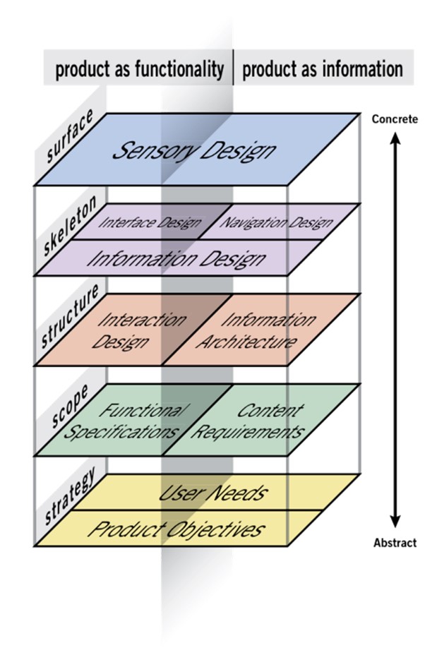
UX design primarily has 5 planes (Strategy, Scope, Structure, Skeleton, Surface) to it but covers a vast range of other aspects too. I will not be talking about these planes but would like to share some important tips, and few dos and don’ts while designing digital properties for your users.

Image credit: “The Elements of User Experience” book written by Jesse James Garrett
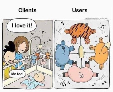
- Design for your users and “YOU” are not the user.
You know a lot about your product/service/business but not everything about your user. We try to generalize based on our personal experience which ends in design failure.
It is important to design for different age groups who have diverse needs and attitudes. Whether it is the Gen X, Gen Y, Gen Z, Xennials or Millenials, step into their shoes and design accordingly.

Image credit: vk.com/piterskii punk wall
- User research is very important, and it is your responsibility.
Many a times people think that user research is a waste of time and money. It is very important for you to change their mindset. If we are not understanding and solving the user’s problem or their need, then there is a high probability that the project/product will fail.
“If the user is having a problem, it’s our problem.” – Steve Jobs
In 2005, Samsung researched and found out an interesting insight. When TV was switched-off people found their bulky TV to be a piece of furniture in their living room. So, they would often want to hide it. With this valuable insight Samsung changed its TV design to make it more minimalistic and aesthetic. By 2007, Samsung had doubled its share in the global TV market because they understood the user’s problem.

Image credit: Robbie Meriales
- Resist the urge to add fancy stuff.
Adding more fancy stuff will not guarantee app downloads or sales. It will only complicate the interface and the user journey. Keep the focus on prioritizing the features. Ensure that your design is solving the problem and is moving towards achieving the objectives.

Image credit: reddit.com – Is it “FITFOREVER” or “FATFOREVER”?
- Don’t get confused between UX and UI.
Today UX is often loosely used with User Interaction or Usability. UX covers overall end-to-end experience of a user journey. Whereas, UI is the interface that user interacts with in that journey. If UX process is compromised, no amount of beautification will help.

Image credit: designershumor
- UX can become a brand differentiator if done correctly.
Customer experience is built slowly through small multiple interactions. It is how customers perceive their interactions with your brand. Even a small change to their experience can make a big difference. Users experiences the brand through visuals, tone, and behavior. There are ample examples of brands who chose to listen to their customers and disrupted their industry. As there is an increase in competition in the market, it has become more important than ever to differentiate. Netflix is a great example here.

Image credit: Netflix.com
To summarise, user experience is a science as well as an art. There are proven scientific methodologies and principles. It should not be used loosely. Good user experience can not only avoid unnecessary cognitive load or stress, but also ensure product success.


